Over the last few years, lots of changes have happened to CSS that lets you do some pretty cool things, but not all browsers support all the new, fancy properties that are available.
There are some ways around this and some browsers use a different notation for their version of it. Luckily, CSS won’t break a site if something isn’t supported - it just won’t do whatever that line of CSS is.
Unfortunately, not everyone will be using the same browser on the same device at the same size so we’re always going to be running into the issue of some property possibly not being supported for some people. As the world changes, new features are thought up, and iterations of browsers become available, more and more will be supported.
CSS Grid
We recently finished a new version of our theme that we use on client websites and were pretty happy when we were able to start using CSS grid. In the past, because Internet Explorer was still a widely used browser, we weren’t able to use it because it wasn’t supported. Now that IE has been phased out and Edge is the standard (and is a modern browser) we started using it! But, if we had known about @supports, we may have used it anyway.

And here’s the CSS that goes with that.
.grid-container{
    display: grid;
    grid-template-columns: 1fr 1fr 1fr;
}
.grid-item{
    background: green;
    margin: 1px;
    padding: 10px;
    color: white;
}
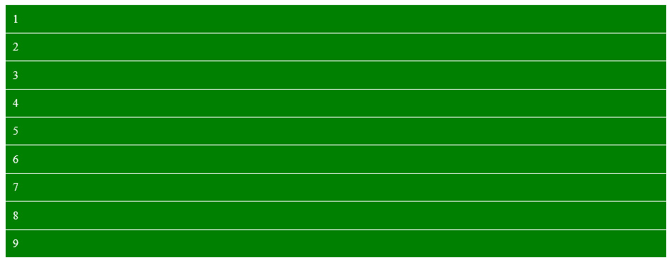
As of this update in 2021, Internet Explorer still does not support CSS grid, but that’s ok because Microsoft has discontinued support so I don’t expect updates. As you can see, the grid is completely broken and is not as intended. It doesn’t break the site, it’s just not formatted at all how it should be.

@supports
Like other helper queries, you can use them to create conditional statements. If you’ve ever worked with responsive CSS and @media queries, it’s exactly like them. Any code you put inside those queries will only run if it meets the requirements of the queries. If you’re a programmer, it’s an “if” statement for CSS.
@supports (display: grid){
        /* do stuff in here if grid is supported */
}
So, we’re asking the browser to check if it supports the grid and if it does, then run the CSS inside of the curly braces. If it doesn’t support grid, then don’t run anything inside of it.
Here are some other syntax versions with different variations on how you can use this style of CSS “if” statements:
@supports not (display: grid){
        /* do stuff in here if grid is NOT supported */
}

@supports (display: grid) and (display: flex){
        /* do stuff in here if grid AND flex is supported */
}

@supports (display: grid) or (display: flex){
        /* do stuff in here if grid OR flex is supported */
}
Putting it all together
So, the unfortunate part is that @supports isn’t supported in all browsers. It’s currently at ~74% supported, which is surprising. It sucks because the browsers that most need it don’t support it. The example of CSS grid doesn’t work in Internet Explorer and neither does @supports so this isn’t the best example because it wouldn’t work but I’m going to show what it could look like if it was supported. Luckily, IE just won’t run anything in @supports anyway, so it won’t break anything if done correctly.
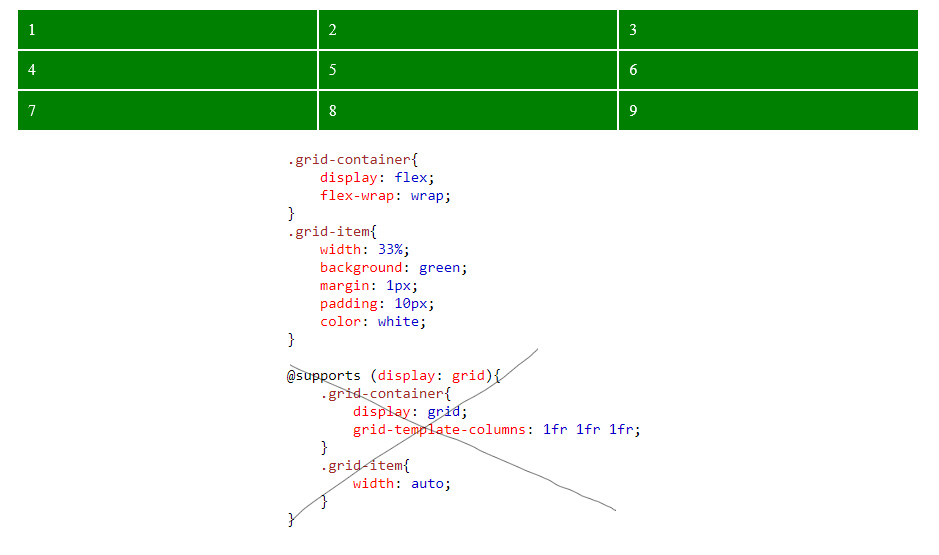
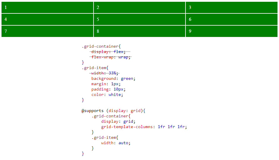
So, let’s write some CSS that has a fallback for older browsers that don’t support CSS grid. We’ll add that CSS first so that any later code in the @supports can overwrite it if it’s supported. We do it this way just in case the browser itself doesn’t support @support.
.grid-container{
    display: flex;
    flex-wrap: wrap;
}
.grid-item{
    width: 30%;
    background: green;
    margin: 1px;
    padding: 10px;
    color: white;
}

@supports (display: grid){
        .grid-container{
                display: grid;
                grid-template-columns: 1fr 1fr 1fr;
        }
        .grid-item{
                width: auto;
        }
}

The above example is in Internet Explorer and the below is in Chrome.

