Flexbox is a brilliant way to create a layout of elements that lets you create alignments and sizes based on a container. The parent container is able to manipulate the children elements inside of it all automatically with very few lines of code. Gone are the days of floats and aligns, Flexbox can handle it all - width, height, order, alignment, etc.
Flexbox was the defacto alignment, layout, grid creation CSS property for a few years. With CSS grid now taking over, it’s being used less and less but it’s still used by us in many cases.
Flexbox Property
Flexbox defines most of its properties on the container where the children live. All the children, then, are impacted by what you put on the parent container and the individual properties you put on the children.
.container{
        display: flex;
}
This will cause any children in that container to function as if you had made them display: inline-block. It will create columns out of any elements inside the container.
<div class="container">
  <div>1</div>
  <div>2</div>
  <div>3</div>
  <div>4</div>
  <div>5</div>
  <div>6</div>
  <div>7</div>
  <div>8</div>
</div>
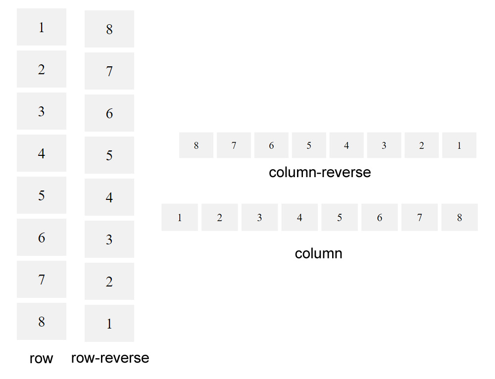
With the above html, it looks like this:

Columns or Rows
The “flex-direction” property lets you set the direction of the items as well as if they should have a column or row layout.
.container {
flex-direction: row | row-reverse | column | column-reverse;
}
In this case, row and column might be a little backwards - row means show the elements as a row (not make each an individual row) and column means show everything as a column (not make each an individual column).
The reverse modifier reverses the order from last to first.

Alignment
Flex makes is easy to set how the child elements should be aligned within the container. Gone are the days of text-align or margin auto and other hacky ways of getting things centered.
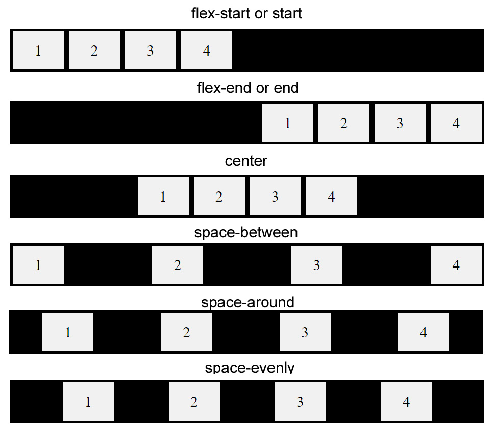
The justify-content property makes it easy to set how it should work. There are a few options and they get a little confusing sometimes so we’ll stick to the simple ones.
.container {
justify-content: flex-start | flex-end | center | space-between | space-around | space-evenly;
}

The ones we use the least - the ones with “space” - are very useful and can save a lot of time not having to do the math to make it happen. It just does it for you!
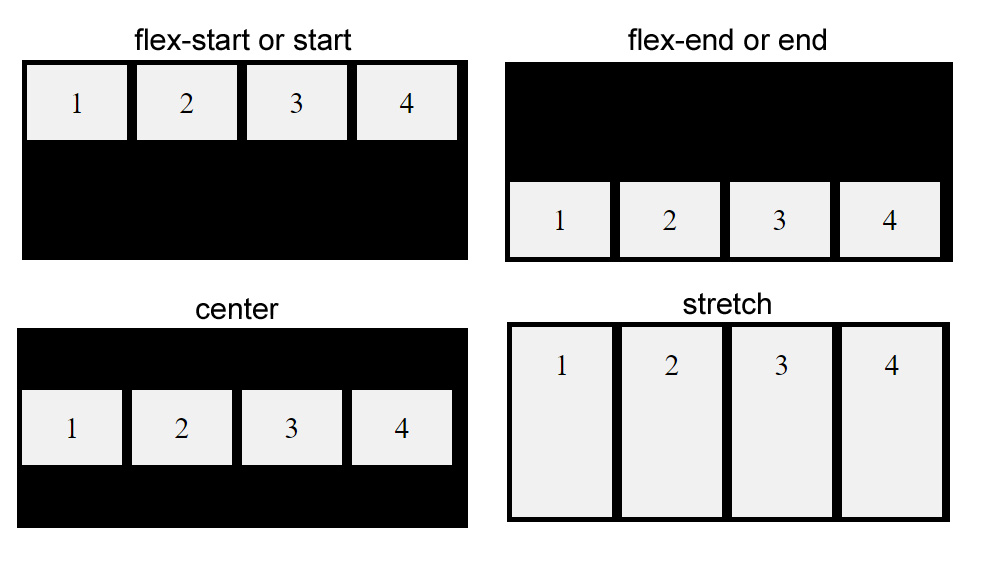
Along with alignment along the X-axis, the Y-axis is also easy to control. This is helpful for when you want to vertically center something. When combined with justify-content, you can easily create an element that’s always centered and in the middle of the screen.
Again, we’ll just go over the simple ones:
.container {
  align-items: stretch | flex-start | flex-end | center;
}

There are a lot more options available to Flexbox that make it one of the most used and powerful systems within CSS at the moment. It’s just so useful for building layouts that it’s a no-brainer to use anywhere you can that involves the layout and structure of a website.
